
Fetching Data and Creating Visuals
Frame the question, drag the attributes into place, and turn the result into a chart.
Framing the Question
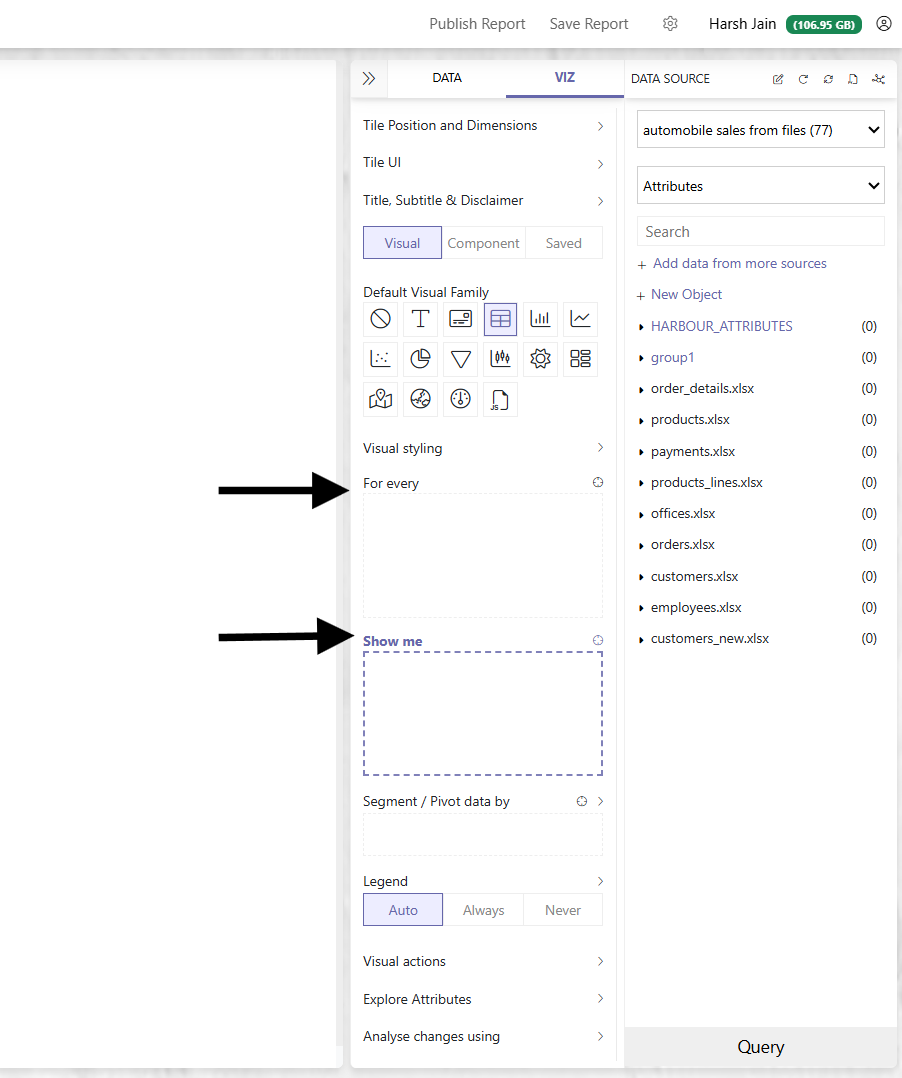
Before creating a visual, frame a story in your mind in the form of "For every X, show me A, B, and C."
For example:
- For every country, show me the number of customers and the total order value.
- For every year, show me the client churn rate.
- Show me customer name, country name, and customer number.
In PersivX build mode, you drag and drop the attributes you want into the relevant box.
Mapping the examples above onto the builder:
- For every country, show me the number of customers and the total order value. Country goes in "For every"; count of customers and total order value go in "Show me".
- For every year, show me the client churn rate. Year goes in "For every"; client churn rate goes in "Show me".
- Show me customer name, country name, and customer number. All three go in "Show me". "For every" stays empty.
Creating Your First Visual
Once you drag and drop fields from the attributes panel, PersivX fetches the data and displays it on screen.
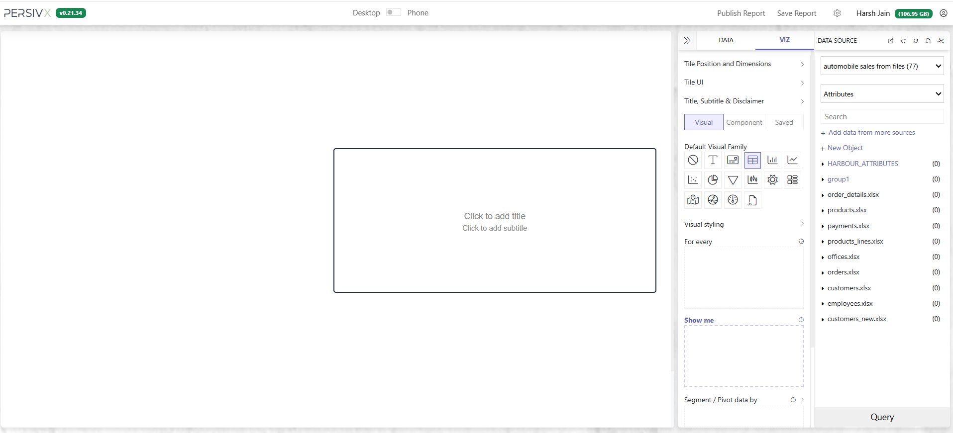
Step 1: Create a Tile
Click and drag in an empty area of the canvas to create a new tile. A tile is where an individual visual lives.
Step 2: Drag In Your Attributes
Drag and drop attributes from the objects (tables) you want to display into the correct box.
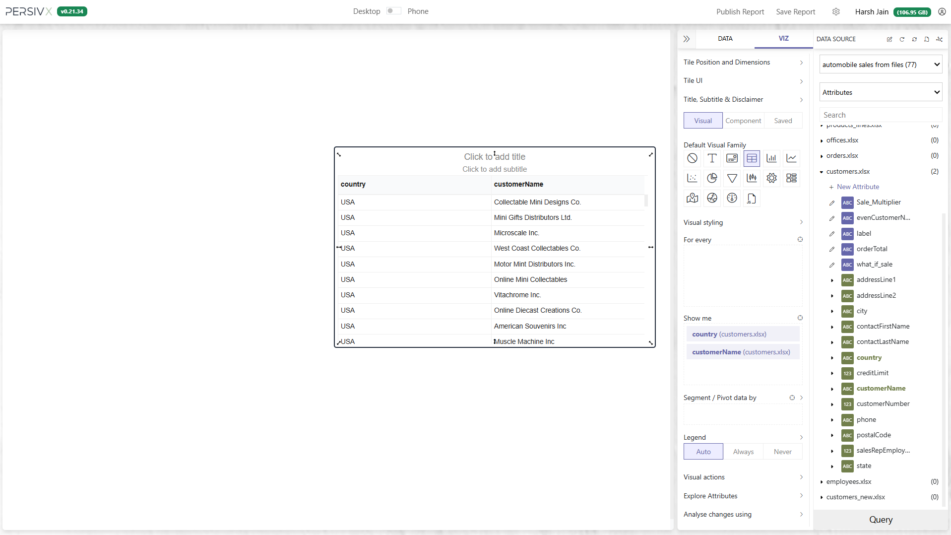
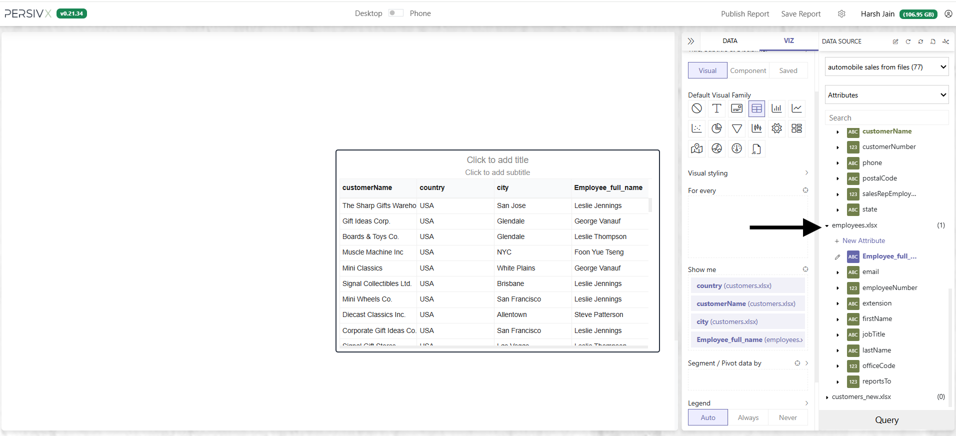
That's it — you should now see data on your tile.
Grouping and Aggregating
Next, let's visualize for every country, show me the number of customers.
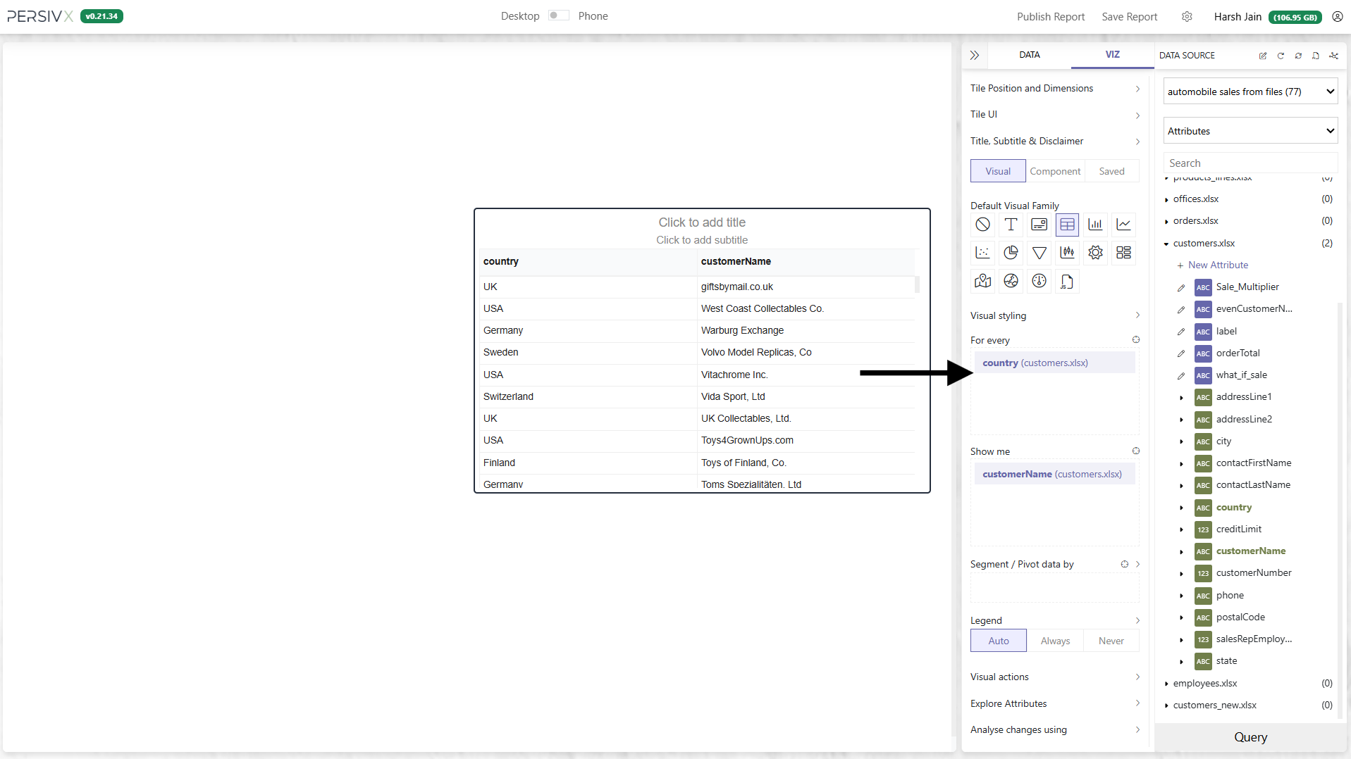
Step 1: Move Country to "For every"
Drag the country attribute from the "Show me" box into the "For every" box.
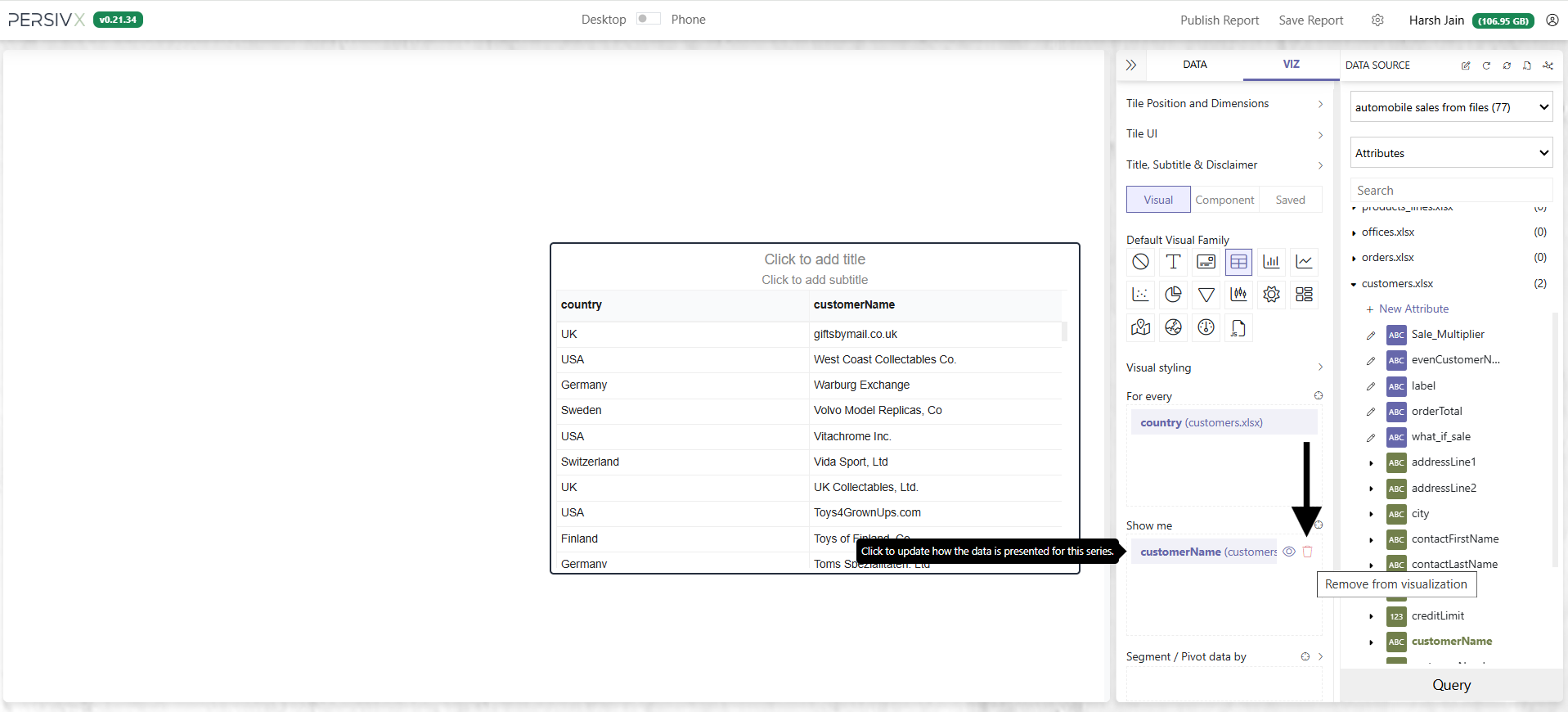
Step 2: Remove Customer Name from "Show me"
We want the count of customer names, not the customer names themselves.
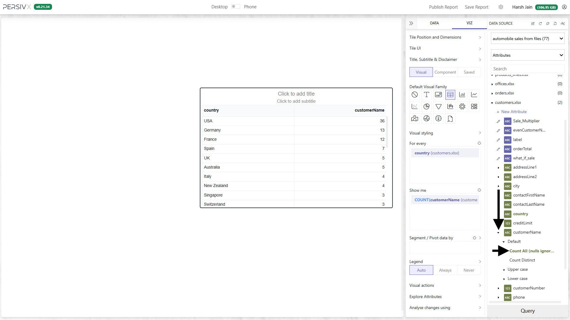
Step 3: Add an Aggregator
Click the arrow next to an attribute name and PersivX lists the aggregators available for that column. Drag Count All into the "Show me" section.
Step 4: Turn It Into a Chart
Now that you have the data you need, change how it is presented. Let's make it a bar chart.
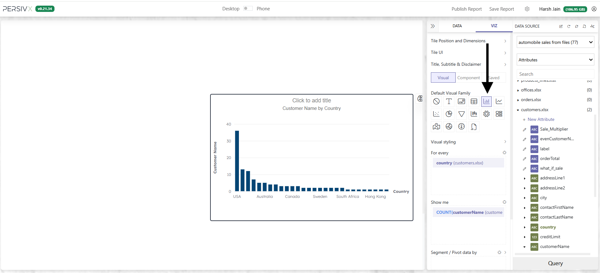
The same works for a line chart, scatter chart, pie chart, or any other available visual.