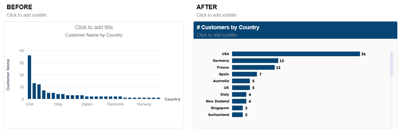
Basics of Customizing Visuals
Take the chart built in Creating Visuals and make it presentable.
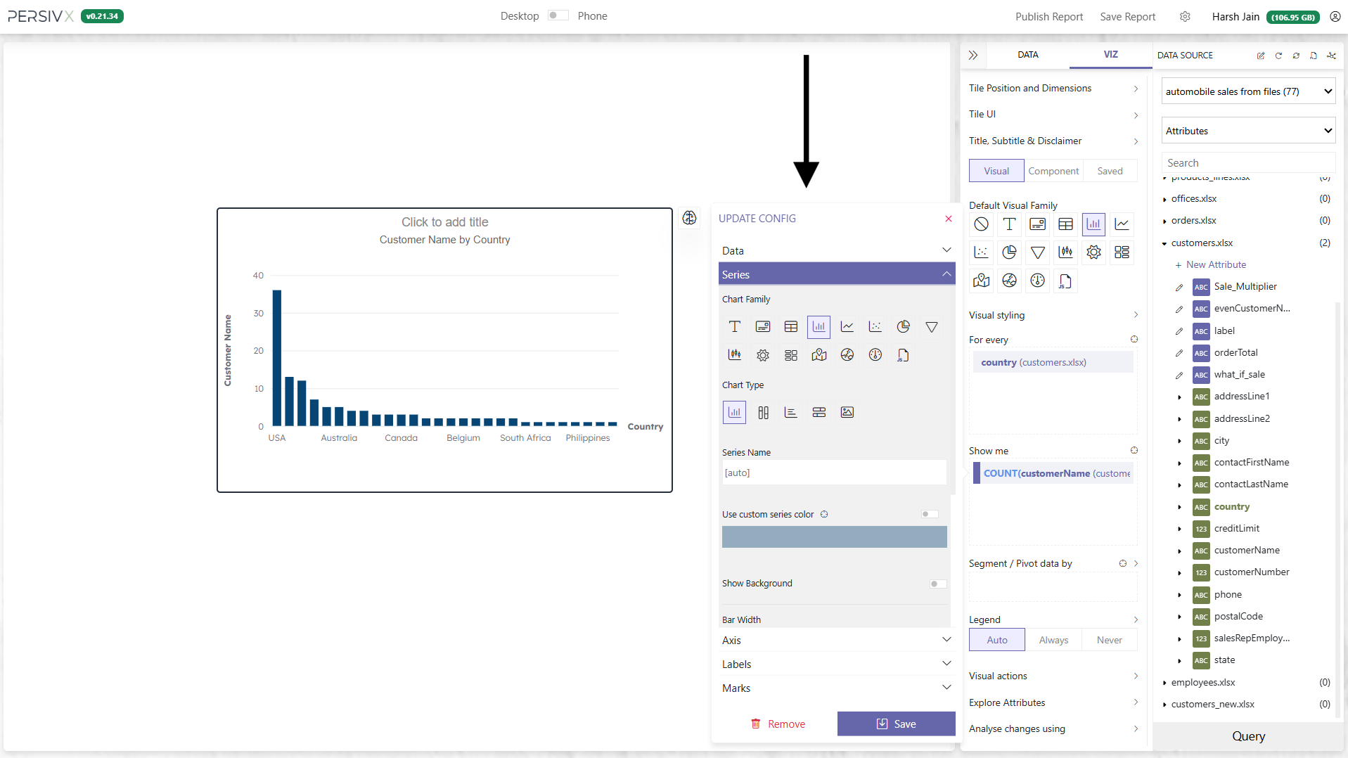
Step 1: Open the Customization Panel
- Click the column you want to customize — start with the bars, i.e. the count of customer names (the Y-axis here).
- This opens the customization panel for that attribute.
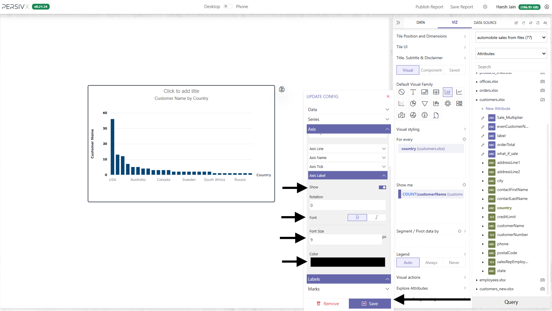
Step 2: Style the Axis Labels
Start by making the axis labels black, bold, and 9px. Click Save when done.
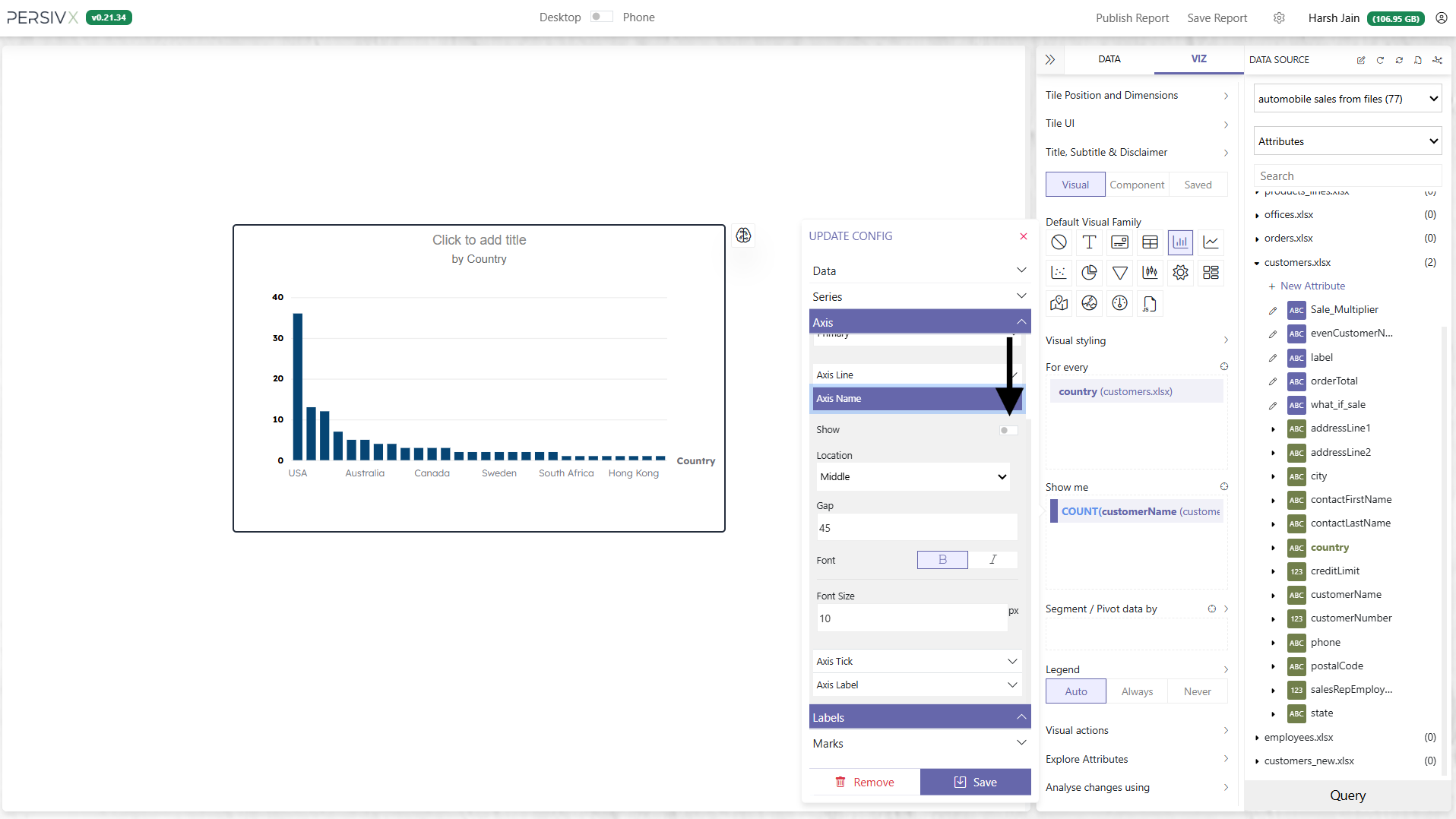
Step 3: Hide the Axis Name
Next, hide the axis name. You will need to open the config panel again. Click Save when done.
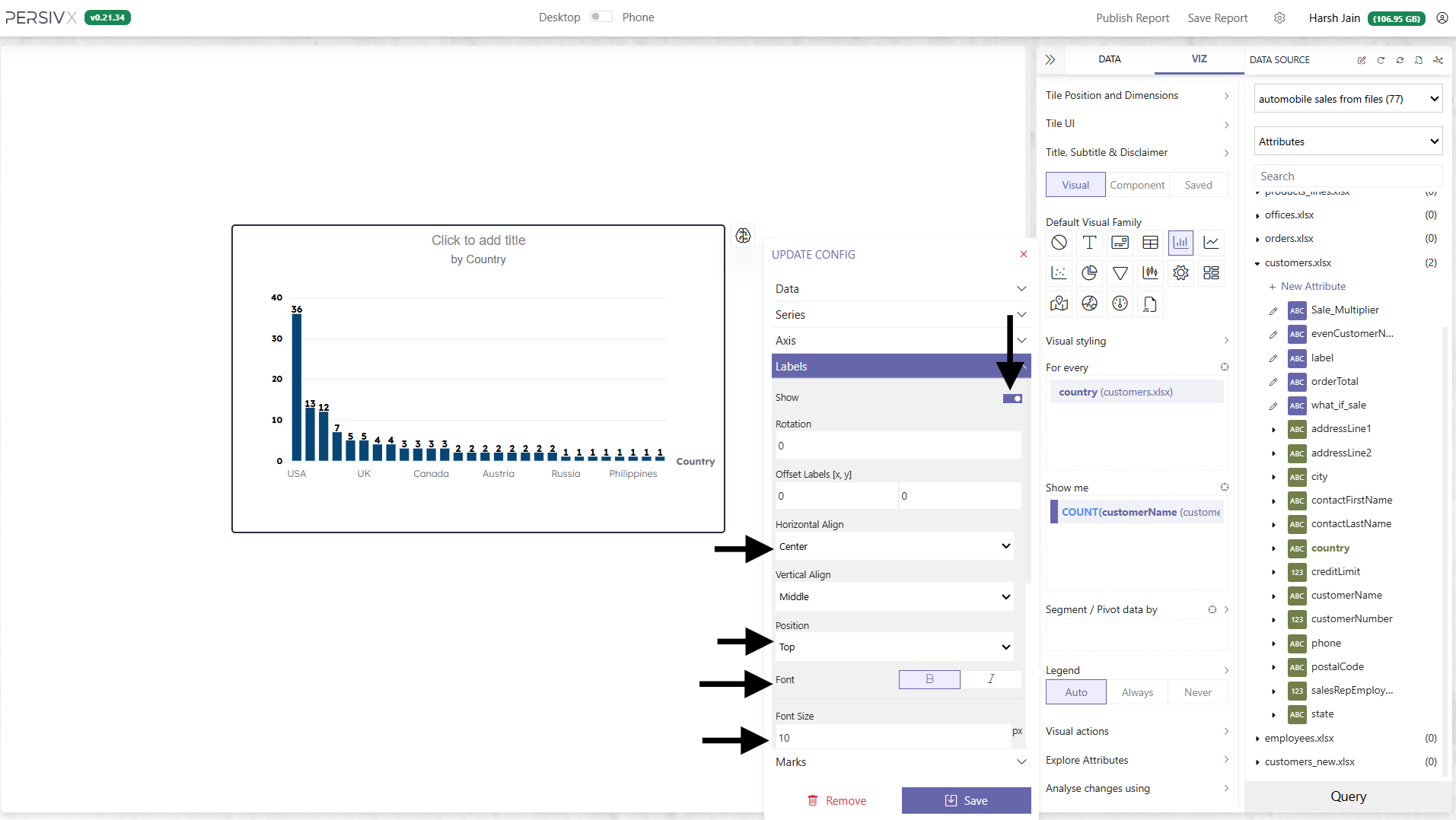
Step 4: Add Data Labels
Add the data labels and customize them. Click Save when done.
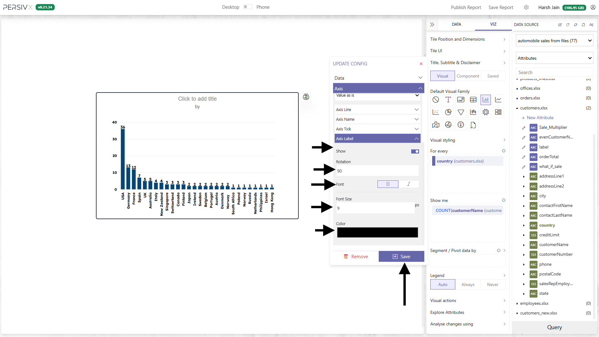
Step 5: Customize the Other Axis
Click on country and customize it the same way. Note that this time the labels have also been rotated by 90°. Click Save when done.
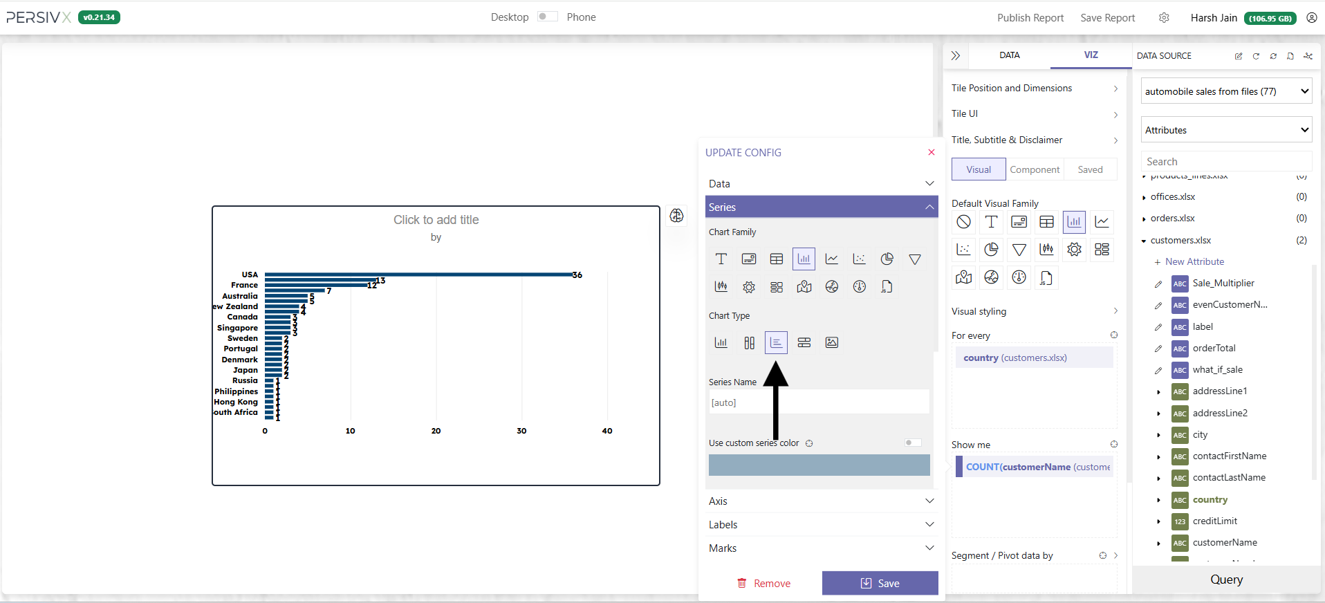
Step 6: Switch to a Bar Chart
Change the column chart to a bar chart: click the "Show me" attribute and change Chart Type to bar chart.
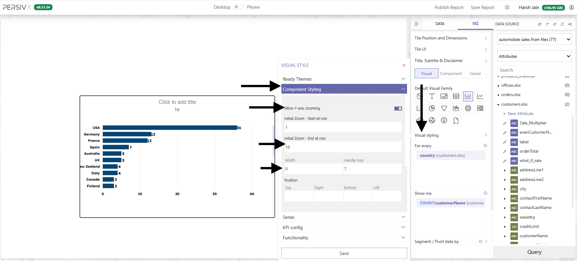
Step 7: Make the Chart Scrollable
There is too much data on the tile. Make the chart scrollable so it stays readable.
- Click Visual Styling › Component Styling › Zoom Controls
- Select Allow Y-axis zooming
- Set Initial Zoom — End at row to
10and width to0 - Click Save
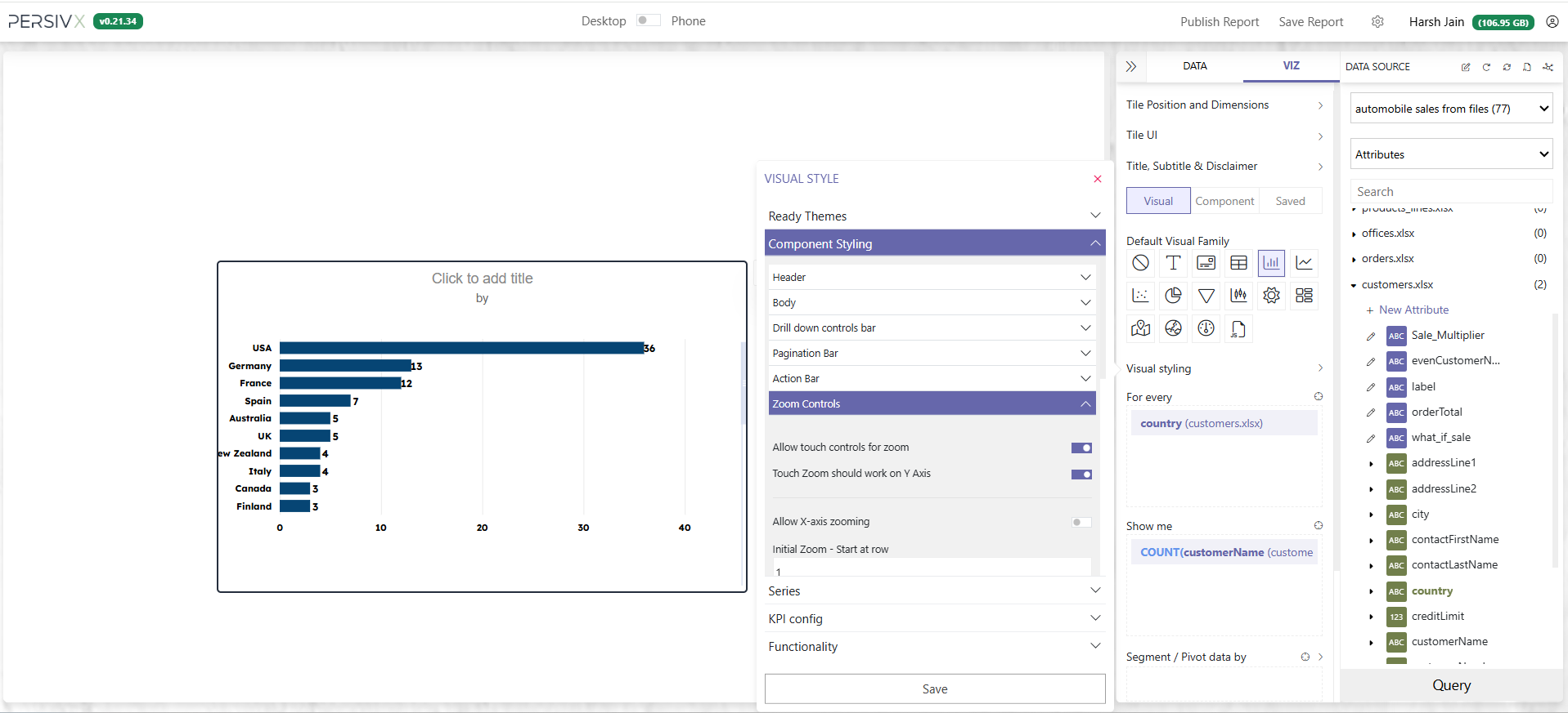
Step 8: Enable Mouse and Touch Scrolling
In the same Zoom Controls section, enable Allow touch controls for zoom and Touch Zoom should work on Y Axis, then click Save.
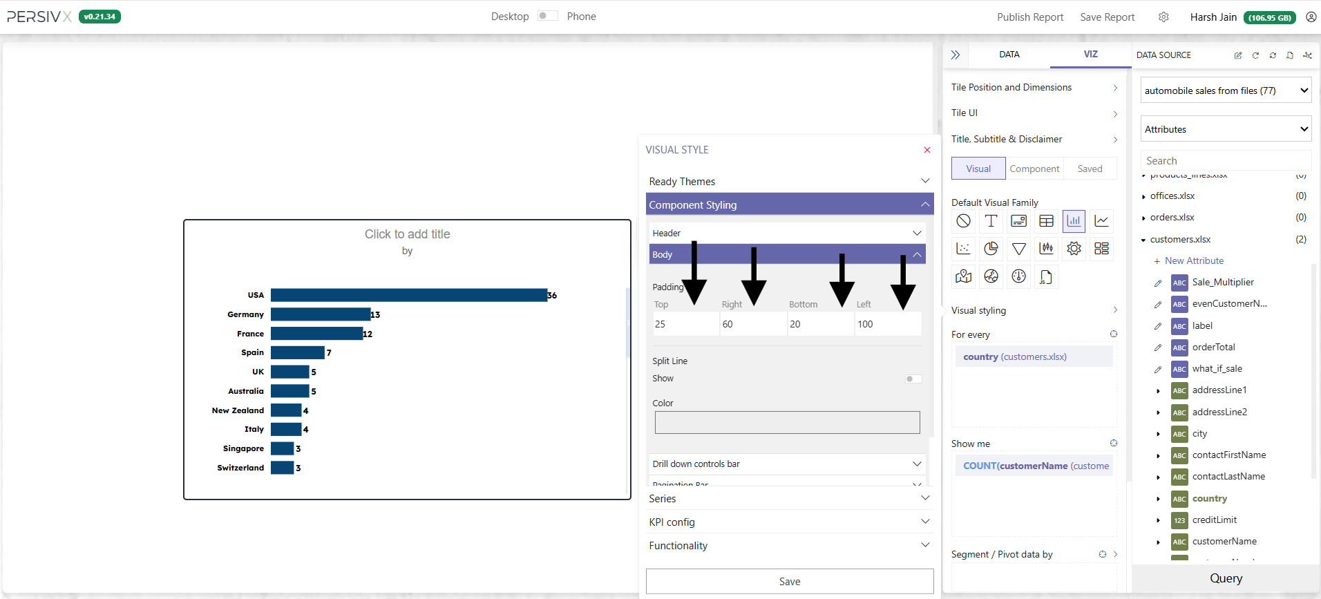
Step 9: Fix the Spacing
The spacing at the left edge is too tight.
- In Visual Styling › Component Styling, find Body
- Update the Padding values
- Click Save
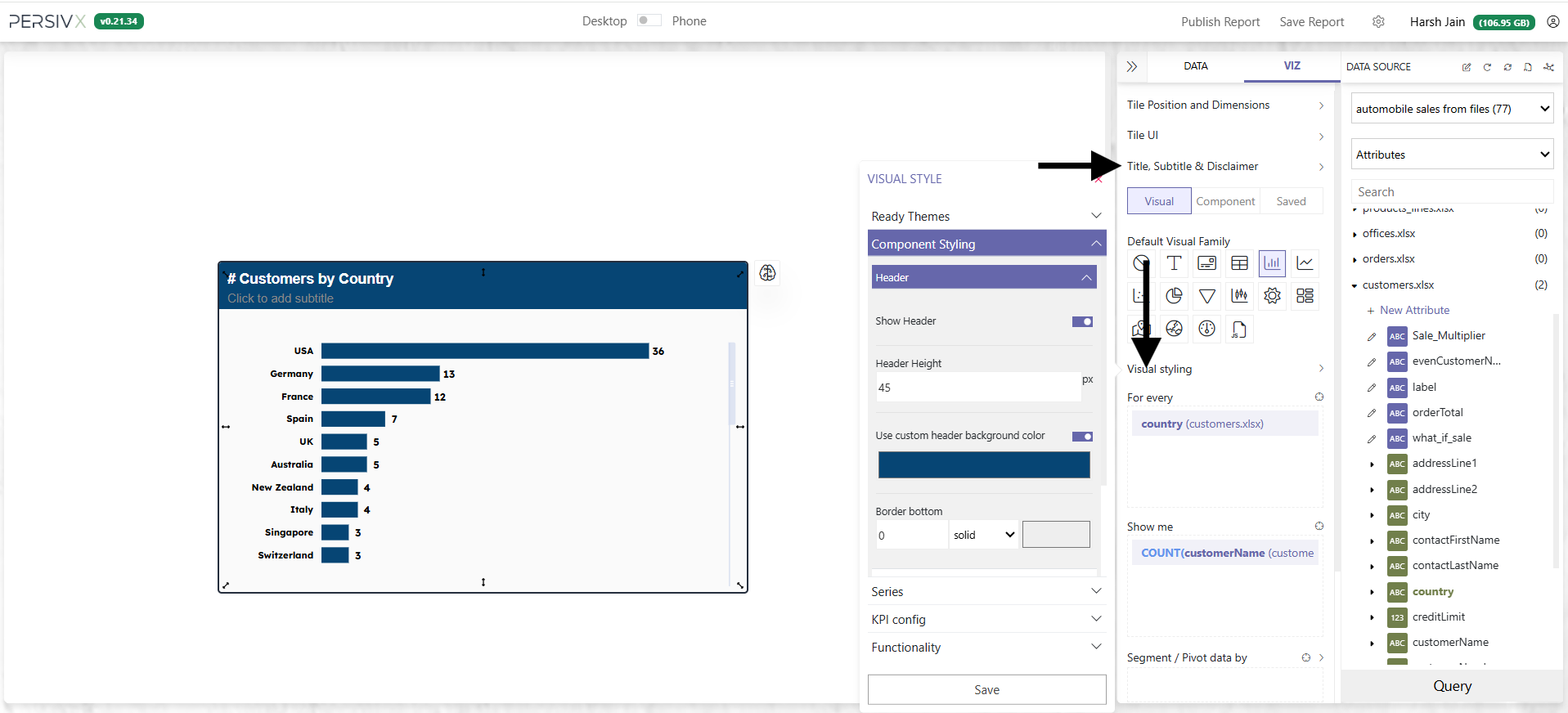
Step 10: Title and Style
Finally, give the chart a title and a style.
- Title options live under Title, Subtitle & Disclaimer
- Header colour options live under Visual Styling › Component Styling › Header